React Navigation 5.0 Custom Drawer
From a default drawer navigation to a well-designed drawer that fits into the application theme and design.

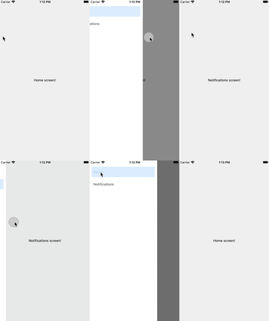
React Navigation provides a navigation solution for React Native applications, with the ability to present common stack navigation and tabbed navigation patterns on both Android and iOS. React Navigation comes with a standard UI for all Navigators.Which will look like below.Complete SourceCode availanle in github
The article drives from a default drawer navigation to a well-designed drawer that fits into the application theme and design.This article required basic setup of React Native and React Navigation is Required.
Default Drawer implementation look like this,

we are going to change this Drawer page content , using drawerContent option. Refer below code page for DrawerNavigator.js with drawerContent
import * as React from "react";
import { createDrawerNavigator } from "@react-navigation/drawer";
import { NavigationContainer } from "@react-navigation/native";
import { createStackNavigator } from "@react-navigation/stack";
import HomePage from "./pages/Homepage";
import ListPage from './pages/ListPage';
import { DrawerContent } from "./DrawerContent";

/*Initiating Navigators*/

const Drawer = createDrawerNavigator();
const Stack = createStackNavigator();

function drawerStack() {
  return (
    <Stack.Navigator initialRouteName="Home" headerMode="none">
      <Stack.Screen name="Home" component={HomePage} />
      <Stack.Screen name="Details" component={ListPage} />
    </Stack.Navigator>
  );
}

export default function DrawerNavigator() {
  return (
    <NavigationContainer>
      <Drawer.Navigator drawerContent={() => <DrawerContent />}>
        <Drawer.Screen name="Home" component={drawerStack} headerMode="none" />
      </Drawer.Navigator>
    </NavigationContainer>
  );
}
And also add Drawer content component (DrawerContent.js ) ,according to your need and map that into DrawerNavigator.js. Refer below code for DrawerContent with stylesheet
import React from "react";
import { View, StyleSheet,Image,ImageBackground } from "react-native";
import { DrawerItem, DrawerContentScrollView } from "@react-navigation/drawer";
import {  Avatar,  Title,  Caption,  Drawer, } from "react-native-paper";
import { MaterialCommunityIcons } from "@expo/vector-icons";

export function DrawerContent(props) {
  return (

    <DrawerContentScrollView {...props} contentContainerStyle={{paddingTop:0,marginTop:0}}>

      <View style={styles.drawerContent}>
      <ImageBackground source={require('./../assets/blue1.jpg')} style={styles.image}>
        <View style={styles.userInfoSection}>
          <Avatar.Image
            source={{
              uri:
                "https://res.cloudinary.com/ruksa/image/upload/v1587470607/profile/pic012_kdiyqt.jpg",
            }}
            size={75}
          />
          <Title style={styles.title}>Rukmoni Nagarajan</Title>
          <Caption style={styles.caption}>@rukstech</Caption>

        </View>
        </ImageBackground>
        <Drawer.Section style={styles.drawerSection}>
          <DrawerItem
            icon={({ color, size }) => (
              <MaterialCommunityIcons
                name="home-outline"
                color={color}
                size={size}
              />
            )}
            label="Home"
            onPress={() => {}}
          />
          <DrawerItem
            icon={({ color, size }) => (
              <MaterialCommunityIcons name="bookmark-outline" color={color} size={size} />
            )}
            label="WishList"
            onPress={() => {}}
          />
          <DrawerItem
            icon={({ color, size }) => (
              <MaterialCommunityIcons
                name="cart-outline"
                color={color}
                size={size}
              />
            )}
            label="Cart"
            onPress={() => {}}
          />
           <DrawerItem
            icon={({ color, size }) => (
              <MaterialCommunityIcons
                name="tune"
                color={color}
                size={size}
              />
            )}
            label="Preferences"
            onPress={() => {}}
          />
        </Drawer.Section>
        <Drawer.Section title="Account">
        <DrawerItem
            icon={({ color, size }) => (
              <MaterialCommunityIcons
                name="account-outline"
                color={color}
                size={size}
              />
            )}
            label="Profile"
            onPress={() => {}}
          />
                <DrawerItem
            icon={({ color, size }) => (
              <MaterialCommunityIcons
                name="logout"
                color={color}
                size={size}
              />
            )}
            label="LogOut"
            onPress={() => {}}
          />

        </Drawer.Section>
      </View>
    </DrawerContentScrollView>
  );
}

const styles = StyleSheet.create({
  drawerContent: {
    flex: 1,

  },
  image: {
    flex: 1,
    resizeMode: "cover",
    justifyContent: "center"
  },
  userInfoSection: {
      margin:0,
      paddingTop:80,
    paddingLeft: 20,
    alignItems:'center'

  },
  title: {
    color:'#fff',
    fontWeight: "bold",
  },
  caption: {
    color:'#fff',
    fontSize: 14,
    lineHeight: 14,
    paddingBottom:20,
  },
  row: {

    marginBottom:10,
    flexDirection: "row",
    alignItems: "center",
  },
  section: {
    flexDirection: "row",
    alignItems: "center",
    marginRight: 15,
  },
  paragraph: {
    fontWeight: "bold",
    marginRight: 3,
  },
  drawerSection: {
    marginTop: 15,
  },
  preference: {
    flexDirection: "row",
    justifyContent: "space-between",
    paddingVertical: 12,
    paddingHorizontal: 16,
  },
});
The output of above coding is

Complete SourceCode here